50+ Best Font Combinations for Graphic Design (2023)
Often as designers, we are faced with the challenge of selecting fonts that work well together and this is why we’ve compiled this list of the best font combinations.
We’ve included the best Google Font combinations, as well as a list of professional font combinations, plus a list of brilliant font duos.
Font duos are basically like a package of fonts that are specifically designed to go well together.
Let’s dive into our list of the best font pairings!
15 Best Google Font Combinations
What fonts work well together? We’ve taken the guesswork out for you, with these tried & true Google font pairs.
- Playfair Display with Source Sans Pro
- Merriweather with Oswald
- Montserrat with Merriweather
- Raleway with Lato
- Elsie with Roboto
- Dancing Script with Josefin Sans
- Abril Fatface with Roboto
- Corben with Nobile
- Spirax with Open Sans
- Wendy One with Lato
- Karla with Montserrat
- Cherry Cream Soda with Raleway
- Amaranth with Open Sans
- Palanquin with Roboto
- Sansita with Open Sans
Also, see our feature on the best Google fonts.
15+ Best Font Duos
Font duos are a combination of two (or more) fonts designed to compliment each other and are generally sold together as a package.
We’ve compiled the best font duo packages online as these naturally make for the best font combinations.
- Virale Recoba Font Duo
- Mindset Font Duo
- Arsen Font Duo
- Walkester Font Duo
- Highrush – Font Duo
- Lovers in London Serif Font Duo
- Magical Moments Font Duo
- Fashion Exquisite Font Duo
- Memories Of Sao Paulo Font Duo
- Night City Lifestyle Font Duo
- Righton – Script & Serif Font Duo
- Thistails Font Duo
- South Route Font Duo & Extras
- Hello Paris – Variable Duo
- Airwaves Font Duo
Also see our feature on the best font bundles.
15 Best Font Combinations for Professionals
Below we share some professional font combinations and font pairings.
- Super Grotesk & Minion Pro
- Montserrat & Courier New
- Rockwell Standard & Lora
- Copernicus & Proxima Nova
- Century Gothic & PT Serif
- Kaufmann & NeutraDemi
- Brandon Grotesque & Minion Pro
- Playfair Display & Museo Sans
- Raleway & Lusitana
- Alternate Gothic & Georgia
- Helvetica & Garamond
- Source Sans Pro & Times New Roman
- Cubano & Nunito
- Proxima Nova & Georgia
- Nimbus Sans Condensed & Athelas
UNLIMITED FONT DOWNLOADS: 400,000+ Fonts & Design Assets

Download all the Fonts you need and many other design elements are available for a monthly subscription by subscribing to Envato Elements. The subscription costs $29 per month and gives you unlimited access to a massive and growing library of 400,000+ items that can be downloaded as often as you need (stock photos too)!
The Best Google Font Pairings
1. Playfair Display with Source Sans Pro Font Combination
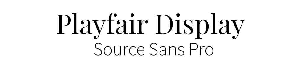
Playfair Display was designed by Claus Eggers Sorense, and is a Traditional Style font. We believe that it works very well with Source Sans Pro, a simpler font style. People are going back to the more traditional styles of fonts, because they look elegant and give a feeling of excellence.
2. Merriweather with Oswald Font Pairing

This font combination is easy to change for width and height and is simple to read. It will undoubtedly appear as a popular typeface in the upcoming years because of its use of serifs and readable text. Merriweather, with Oswald completes the look.
3. Montserrat with Merriweather Font Pairing

Designed by Julieta Ulanovsky, Montserrat is a modern, streamlined and legible font, because it’s a Sans Serif it’s good to pair with a serif font like Merriweather.
4. Raleway with Lato Font Pairing

Raleway is a straightforward yet fashionable sans-serif typeface that can serve a variety of design aesthetics, making it a flexible choice. We paired it with Lato, another sans-serif font, but by utilizing it as the smaller, thinner text, it perfectly complements the header text.
5. Elsie with Roboto Font Combination

This is a beautiful font, it was created to celebrate the world of women and with it’s flowing edges and serifs it is very elegant. It’s such a detailed font it needs to be paired with something very simple. This is why a font such as Roboto is perfect, it doesn’t detract away from the style of the header font.
6. Dancing Script with Josefin Sans Font Combo

This font combination will make your project stand out because the script font is creative and flawless. It is a good idea to pair with simple fonts like Josefin Sans to complement the Dancing script font.
7. Abril Fatface with Roboto Font Pairings
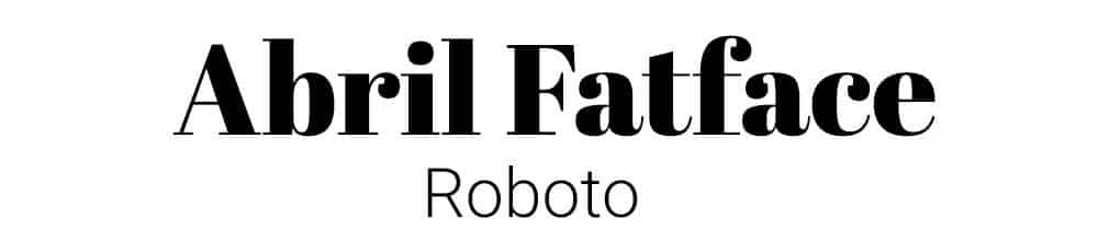
A very unique and interesting font style, with its Didone style serifs and bold lettering, Abril FatFace really grabs your attention. When pairing it, you must have something subtle and clean like Roboto, which is a sans serif style font.
8. Corben with Nobile Font Pair

Corben is a bold font with deep and curled ends that stand out in a crowd. Because this font is bold and heavy, you can pair it with basic simple-looking fonts such as Nobile, which is also slightly bold and goes well with the Corben.
9. Spirax with Open Sans Font Combination

A unique font that gives the sense of whimsical mystery and storytelling. Designed by Branda Gallo, it works beautifully well with a simple san serif font, like Open Sans.
10. Wendy One with Lato Font Combination

Wendy One is a bold, quirky, eye-catching font with perfect finishing designed by Alejandro Inler. Lato has the same perfect finish but is not as bold as the Wendy one. Hence, these font combinations give a complete look.
11. Karla with Montserrat Font Pairings
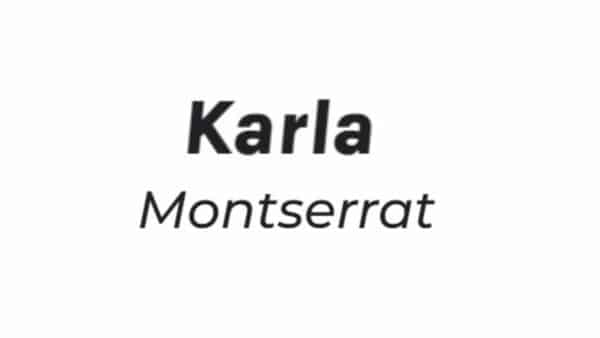
The Karla font was initially designed by Jonny Pinhorn for Tamil script and Latin, but now it has been expanded and works well with a simple font like Montserrat due to its lighter weight.
12. Cherry Cream Soda with Raleway Font Pair
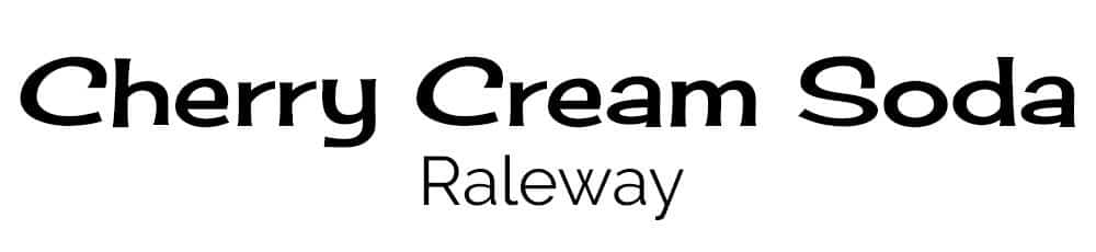
Cherry Cream Soda font is designed by Font Diner, and it inspires memories of the 1950s soda fountains. It’s a distinct style that requires a simple font with clear straight lines, such as Raleway.
13. Amaranth with Open Sans Font Combination

This font creates interest because it’s not just a simple straight font. It has slight curves that make the lettering eye-catching. It could be used for many different applications in design and should be paired with a sans serif font, like Open Sans.
14. Palanquin with Roboto Font Combo

You can use Palanquin with many different weights and heights and make it look fantastic because it is a flexible typeface. It was created by Pria Ravichandran and can be paired with a simple font like Roboto.
15. Sansita with Open Sans Font Pair

A wavy, stylish font, created by Omnibus-Type, with a variety of sizing options available. It is easily paired with a sans serif font, like Open Sans.
UNLIMITED DOWNLOADS: 400,000+ Fonts & Design Assets
All the Fonts you need and many other design elements, are available for a monthly subscription by subscribing to Envato Elements. The subscription costs $29 per month and gives you unlimited access to a massive and growing library of 400,000+ items that can be downloaded as often as you need (stock photos too)!
15+ Perfect Font Duos (Font Combinations Designed to Complement Each Other)
If you’re looking for modern font combinations and logo font combinations, this compilation is for you!
1. Virale Recoba Font Duo
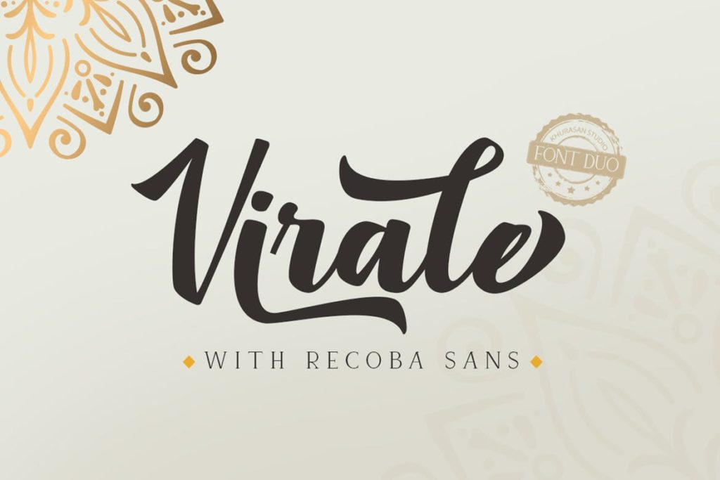
A combination of a sans serif and a modern font, the Virale Recoba Font Duo is a stellar solution for those working on marketing materials. As if a classy-looking invitation to an upscale gathering, this set optimizes a thick, penmanship-like calligraphy font partnered with a neat and clean-looking serif.
2. Mindset Font Duo
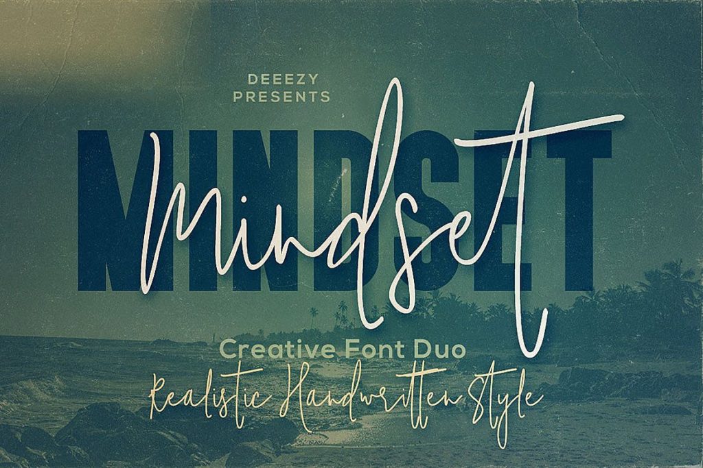
If a script style and bold serif font are what you’re looking for, give Mindset Font Duo a chance. Great for advertising efforts and social media art cards, this contender optimizes a boxy frame partnered with a slender script, giving your designs a balanced mix of soft and heavy. This pair is ideal for a lot of things, so use it as you wish!
3. Arsen Font Duo
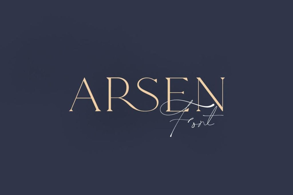
One of the classier picks on the list is Arsen Font Duo. As if designed primarily for branding initiatives, this modern font and script-style typeface partnership work candidly well. Combining a slender aesthetic with a cursive visual, this contender feels premium and sophisticated without even trying. Great for logos, packaging designs, or even greeting cards, there are a lot of projects you can complete with this one.
4. Walkester Font Duo
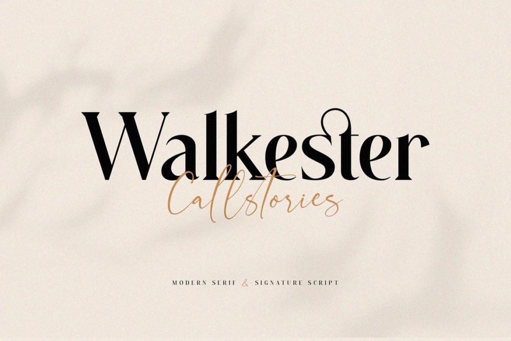
Walkester Font Duo merges the simplicity and familiarity of a modern serif and a signature script. Suitable for publication projects and editorial campaigns, this classy contender is a fantastic visual solution to a lot of things. Its alternate ligatures also add depth and character to your designs, should you need variety in one frame.
5. Highrush – Font Duo
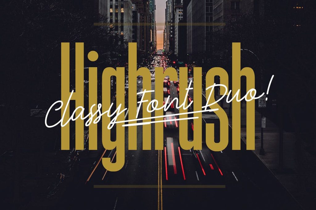
If you’re wondering what a condensed font and a handwritten font would look like, Highrush – Font Duo is the answer. Balancing a square-ish structure with rounded sides in this bundle is the familiarity of a script typeface. All things considered, this pick is a terrific addition to projects that call for an amicable vibe.
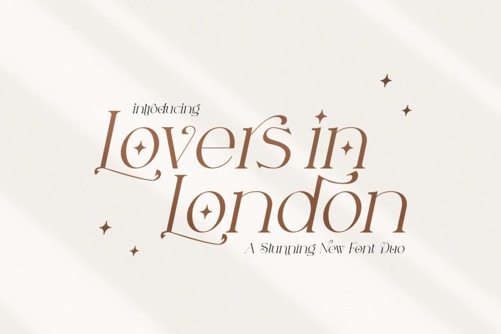
6. Lovers in London Serif Font Duo
Lovers in London Serif Font Duo is a captivating serif duo that makes great use of regular and italic characters of its version. Creamy in slanted lines and sprinkled with sparkle-like icons, this pick is inherently sophisticated and catchy. Great for stationery projects and the likes, there are a ton of designs you can complete here.
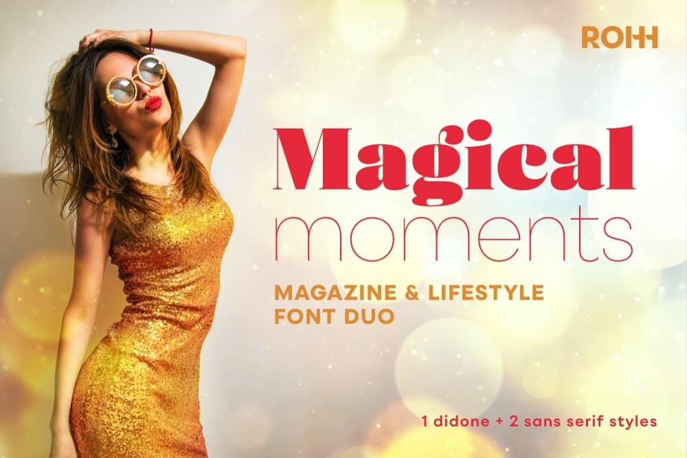
7. Magical Moments Font Duo
Magical Moments Font Duo is composed of a didone and two sans serif styles. Packaged as a magazine and lifestyle font duo, this playful visual solution is a fantastic addition to editorial projects and publication efforts. Nonetheless, it’ll thrive in marketing designs and branding campaigns too.
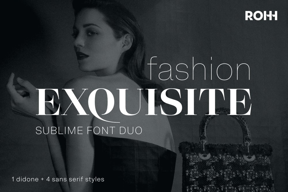
8. Fashion Exquisite Font Duo
Loaded with 1 didone and 4 sans serifs, the Fashion Exquisite Font Duo bundle definitely packs a punch. Perfect for those going for upscale branding campaigns, this pick is elegant and easy to experiment with, making it a fantastic choice for marketing leaders.
9. Memories Of Sao Paulo Font Duo
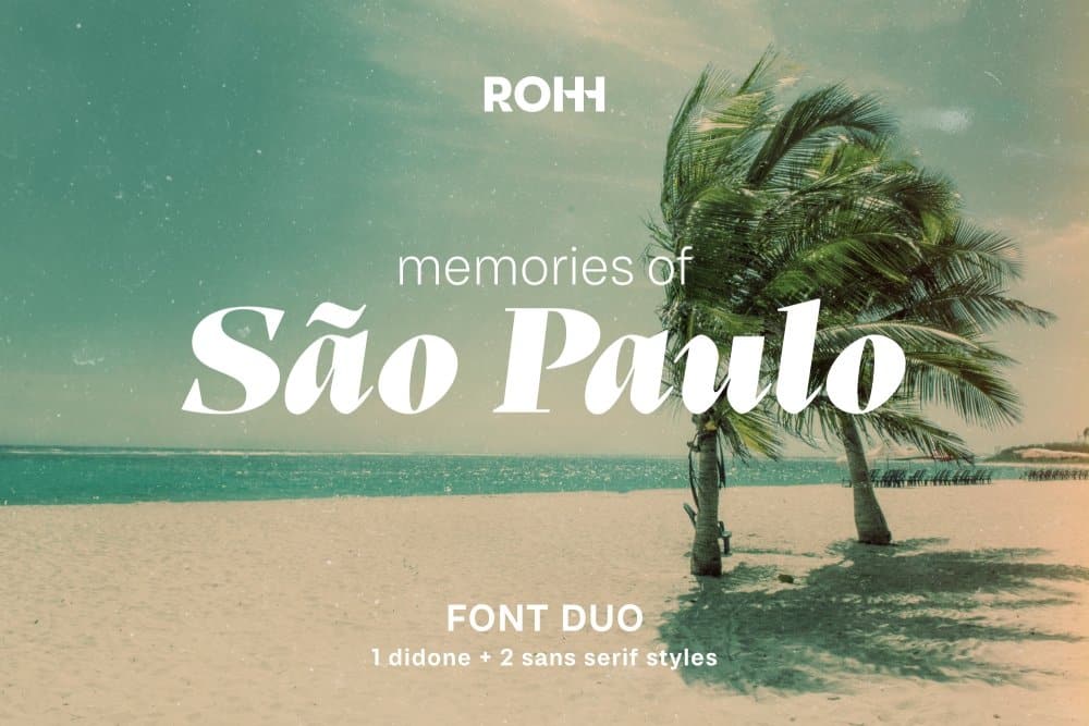
According to its product description, Memories Of Sao Paulo Font Duo is “a modern, dynamic and playful font duo that creates powerful impact and light character.” A set 3 of carefully matched fonts, this bundle is a stellar option for business owners who continually churn out product art cards. Its fonts are legible, youthful, and easy to read.
10. Night City Lifestyle Font Duo
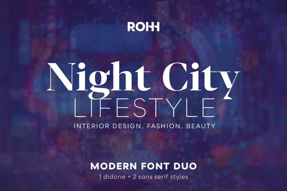
Do your designs focus on fashion on lifestyle? If they do, Night City Lifestyle Font Duo could be what you’re looking for. Loaded with slender and geometric-inspired typefaces, this set is both novel, fresh, and innovative, but still slightly familiar.
11. Righton – Script & Serif Font Duo
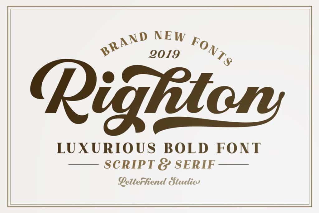
As you can already tell by now, a script and serif go well together. If you need more proof of this claim, let Righton – Script & Serif Font Duo back us up. Great for projects that require bold texts, this pick is classy, familiar, and every inch playful.
12. Thistails Font Duo
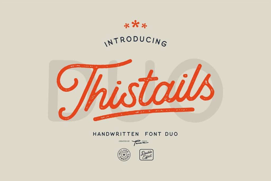
Thistails Font Duo packs script and display serif fonts, making this a competent pick for those working on branding projects. Whether for small businesses or mid-sized ventures, this contender is a versatile bundle that’ll easily let designers play with their imagination.
13. South Route Font Duo & Extras
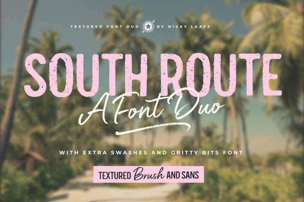
Loaded with an “all-caps sans serif and a bold & sassy fashionable script,” South Route Font Duo & Extras is another great option for social media designers. As if produced primarily for marketing purposes, the fonts in this bundle resemble those we typically see on art cards and pictures of inspirational quotes on Pinterest.
14. Hello Paris – Variable Duo
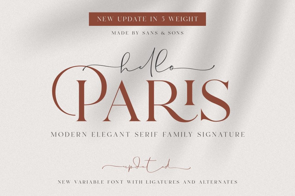
An elegant serif paired with a signature font, the Hello Paris – Variable Duo is a stunning set made for those who need to whip up an upscale-feeling project. Great for both branding and marketing efforts, there are a ton of campaigns one can create with this pack.
15. Airwaves Font Duo
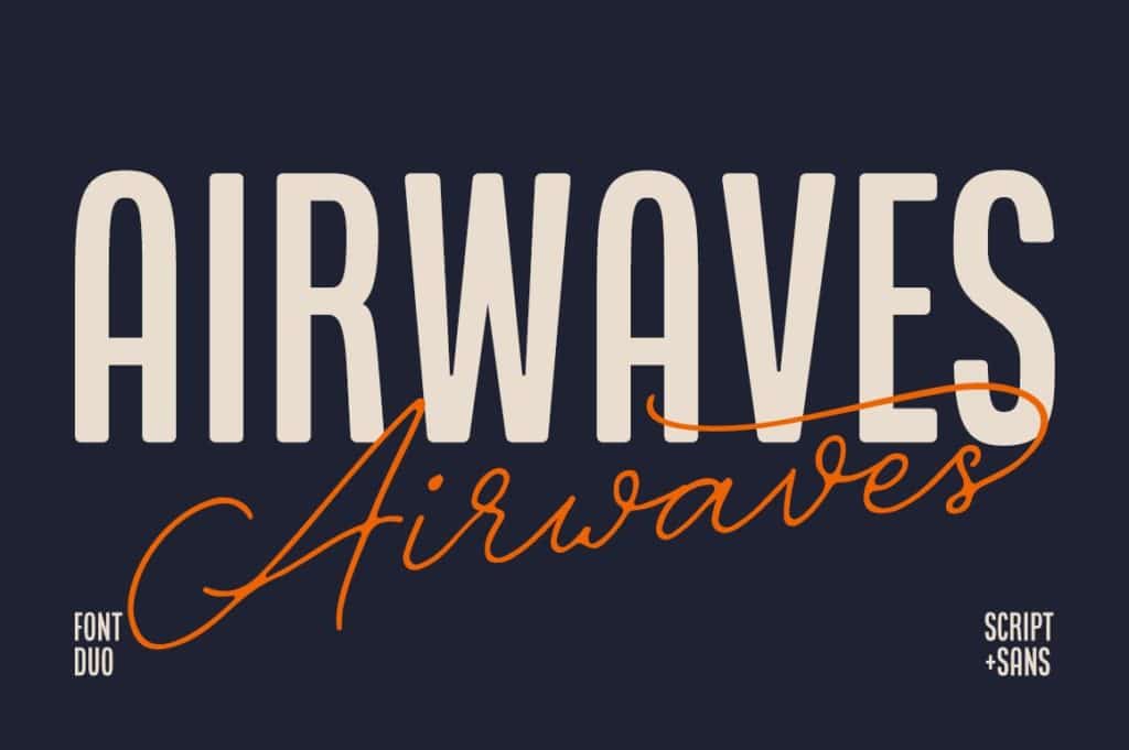
If you’re looking for a “condensed sans serif & signature-ish script” then give Airwaves Font Duo a try. As if made for book covers, this pack consists of a legible typeface that comes with a familiar cursive font, making it a beautiful visual attraction for a whole lot of projects.
15 Best Professional Font Combinations
Typography pairing: perhaps the single most frustrating and time-consuming task you’ll face as a designer when starting any new graphic design project.
For many reasons, it’s something that’s extremely hard to get right, and despite the fact that there are literally thousands of typefaces to choose from, it’ll probably always seem as though the typeface you actually want simply doesn’t exist.
Even if you do manage to pick a winning primary typeface for your design, you’ll then need to begin the painstaking process all over again in order to find yet another typeface to compliment your original choice (help!).
Despite the fact that so many people struggle with this, there isn’t much help out there. Sure, you can use a typographic cheat sheet (such as this one for Google Fonts), but that doesn’t always get the job done.
So, we thought we’d scour the web for some stunning font combinations, with the aim of giving you some inspiration when it comes to combining type. Enjoy these top font pairings!
1. Super Grotesk & Minion Pro

Usually, when combining typefaces, it pays to keep things simple and follow well-established rules (such as combining a sans serif typeface with a serif one), and this is exactly what this site has opted to do.
For the large type, Minion Pro has been used. Minion Pro is a beautiful serif typeface that has an air of luxury about it. For smaller type, you can see Super Grotesk, a sans-serif typeface that appears quite thin, light, and extremely modern.
It’s a perfect match that creates a luxurious yet minimalistic brand.
2. Montserrat & Courier New

Claire Marion has opted for a very minimalistic look here by making use of Montserrat and Courier New.
The reason Montserrat is a popular typeface all over the internet is that it is a simple, clear, beautiful, and contemporary sans-serif typeface that is perfect for all uses.
Courier New, on the other hand, is used less on the web, and as you can see, the styling is somewhat reminiscent of the sort of type that a typewriter might produce.
3. Rockwell Standard & Lora

Politicians for Change has made use of two great fonts here that aren’t all too different in their appearance.
Rockwell Standard (which has been used for main headings) is classified as a slab-serif typeface, whereas Lora (which is used for subheadings) is classified as a serif typeface.
They’re by no means the same, but when using a slab-serif/serif combination, the similarities are more pronounced than say a serif/sans-serif combo.
Still, it’s a great combination.
4. Copernicus & Proxima Nova

Copernicus isn’t typically a typeface that you see too often, which is a shame, as it’s a stunningly well-crafted typeface that deserves more attention.
In this design, it has been used primarily for headings and titles, with Proxima Nova being featured alongside it as the main body font.
It’s a traditional serif + sans serif pairing, and the two types work beautifully together. Proxima Nova does an excellent job of displaying paragraph text in a comprehensible manner, especially at small font sizes, while Copernicus makes sure the titles are eye-catching.
5. Century Gothic & PT Serif

Here, we have another great sans serif + serif typeface combination, but this time we’ve got Century Gothic and PT Serif.
Clearly, PT Serif is the serif typeface, and it has been used primarily for the paragraph text. It’s a stylish typeface that is elegantly crafted, making it perfect for this brand.
The same goes for Century Gothic; it has a certain style to it that, for whatever reason, just seems to compliment PT Serif perfectly. It’s not all that dissimilar from Source Sans or even Proxima Nova.
6. Kaufmann & NeutraDemi

Kaufmann and NeutriDemi might not be a combination you’ve necessarily seen before, but as you can see from the example above, it’s a combination that works extremely well.
NeutraDemi is a superb example of a contemporary sans-serif typeface that conveys grace and elegance, and Kaufmann’s handwritten quality gives the design some flair.
Due to how dissimilar they are, you may not think to pair these two together, but for the appropriate project, it’s the ideal combination.
7. Brandon Grotesque & Minion Pro

We’ve seen Minion Pro featured already in this post (the first example) alongside Super Grotesk. Here though, it features alongside Brandon Grotesque and plays a slightly different role.
Whereas in the first example, Minion Pro was used for the large headings, here it is used predominantly as a body typeface. The great thing about Minion Pro is that it’s a classic, highly readable serif typeface, making it the perfect choice for smaller text.
Brandon Grotesque is used for the headings; it’s thick, bold, and grabs your attention.
8. Playfair Display & Museo Sans

It’s often difficult to find a typeface that offers elegance, class, and style without being too overly flamboyant and unreadable. Luckily, Playfair Display matches that brief perfectly.
Although Playfair Display is a traditional serif typeface, it is much more than that. It appears as a simple typeface that isn’t too direct while still having a feeling of class and elegance (just take a look at the design of the “&” above, for example).
Museo Sans – a sans-serif typeface – is the perfect partner, as its simplicity helps to counteract some of Playfair Displays flair.
9. Raleway & Lusitana

If you’ve ever visited the website of any freelance SEO specialists before, you’ll no doubt have come across something poorly designed that holds very little regard for typographic beauty.
Obviously, this is a bit of a generalization, and while it’s true for most of these kinds of sites, there are outliers, such as this site.
Mary has used Raleway (a free font from Google Fonts) and Lusiana to create a warm, welcoming, and down-to-earth brand for herself. Again, it’s a serif + sans-serif combination that hasn’t been overthought.
10. Alternate Gothic & Georgia

Simplicity is the name of the game here, as you can tell from the minimalistic and relatively flat design of the site.
There’s a reason for this simplicity, too: it keeps the product center stage and makes sure not to detract your attention with unnecessarily flamboyant design elements.
The typography used throughout the site also adheres to this design philosophy. It’s yet another class sans-serif + serif combination making use of Georgia and Alternative Gothic.
Georgia is arguably one of the most attractive yet subtle serif types available, whereas Alternate Gothic is a straightforward sans-serif typeface.
11. Helvetica & Garamond Font Combination

Here’s another site that keeps things relatively simple with the use of Helvetica and Garamond.
Helvetica is the primary typeface used throughout the site, which helps to keep things as simple as possible. It’s a portfolio site, so it’s important that nothing detracts from the content, which is what makes Helvetica the perfect choice.
Garamond is used sparingly and quite rightly so, too, as in its italic form, it can become overbearing when used in large quantities.
12. Cubano & Nunito

Cubano and Nunito aren’t the most common typographic combination out there, and it’s not hard to see why: it combines to create quite a unique design that would only be appropriate for certain brands.
Despite this, though, it’s still a stunning combination. It would work particularly well for a non-profit organization, a charity, or perhaps a business with sustainability at its heart.
You’ll notice that both of these typefaces are sans serif; this can often cause a clash of styles due to typeface similarity, but in this instance, the two fonts are so different that there’s no fear of this.
13. Source Sans Pro & Times New Roman Font Combination

Times New Roman is seldom used on the web these days, primarily because most designers opt for newer and seemingly more modern typefaces in their designs.
However, it’s important to remember that Times New Roman is a great typeface, especially if you’re looking for a highly readable serif typeface that will no doubt bring a sense of familiarity to your design.
Source Sans Pro is a slightly more common typography choice, which works beautifully alongside Times New Roman, especially if you’re looking to create a simple and elegant brand.
14. Proxima Nova & Georgia Font Combination

Proxima Nova and Georgia are becoming a classic typographic combination, especially on the web.
In fact, you’ve probably seen the combination across numerous websites, and there are a couple of perfectly valid reasons for this. Firstly, it’s a stunning combination, and secondly, it’s perfectly suited to a variety of different brands and styles.
Unsurprisingly, it’s a sans serif + serif combination, with Georgia being used for smaller body text and Proxima Nova being used for headings/subheadings.
15. Nimbus Sans Condensed & Athelas Type Combination

If you want to create a brand that oozes elegance and luxuriousness, there aren’t many typographic combinations more suitable than Nimbus Sans Condensed and Athelas.
Athelas is a stunning serif typeface that isn’t all too dissimilar from Georgia, albeit with a little more class and personality to it. Nimbus Sans Condensed, on the other hand, is the complete opposite: a chunky, condensed sans-serif typeface.
As per usual in the world of typography, opposites attract, and that’s certainly the case here.
How to Combine Fonts Video Tutorial
Frequently Asked Questions
What are font combinations?
Font combinations or font pairings that complement or balance each other. Although the general feel of these fonts should be cohesive, they can also add contrast or accent to help the overall typographic theme stand out.
What are some good Google font combinations?
Playfair Display with Source Sans Pro Font Combination, Playfair Display with Source Sans Pro Font Combination and Abril Fatface with Roboto Font Pairings are great Google font combinations to opt for as they are great pairings to use for several unique requirements.
What are the best professional font combinations?
Some good professional font combinations include Raleway & Lusitana and Century Gothic & PT Serif are some great professional font combinations as they are more modern fonts that are great for almost all professional settings.
What are good serif and sans serif font combinations?
Copernicus & Proxima Nova, Rockwell Standard & Lora, and Raleway & Lusitana are some good serif / sans-serif font combinations as they do a great job of balancing each of their counterparts well.
What is a great script and serif font combination?
The Dancing Script with Josefin Sans Font Combo is a great script and serif font combo, this combo is perfect for more decorative and classy designs.
What are some elegant font combinations?
Century Gothic & PT Serif, Alternate Gothic & Georgia, and Elsie with Roboto Font Combination are some great elegant font combinations as they do a good job combining the old world with the new.
What is a good luxury font that pairs well with others?
Super Grotesk & Minion Pro and Nimbus Sans Condensed & Athelas Type Combination are good luxury font combinations for more luxurious branding and design.
Related Font Posts
- Best Clean Modern Fonts
- The Top 100 Best Fonts Of All Time
- Timeless Fonts
- Best Modern Fonts
- Most Iconic Fonts
- Classic & Elegant Fonts
- Best Script Fonts
Best Google Font Combinations & Typeface Combinations Infographic
Check out this infographic that shows the art of mixing typefaces using Google fonts.

What other font combinations would you recommend?
source https://justcreative.com/font-combinations/


Komentar
Posting Komentar
Tulis Komentar (Yang Sopan) disini...